Most Commonly Used VuetifyJS Components - Data Table
120021. Introduction to This Course
In this course, you will learn how to create a web page with CRUD (Create, Read, Update, Delete) functionality using VuetifyJS's data table component. In programming, data operations include adding, deleting, modifying, and querying, making this component one of the most commonly used components.
By using this component, you will find that it requires several components to work together to accomplish tasks. Mastering the combination of multiple components can enhance your programming skills. Try using this component to create a data table for student management.
Watch the video tutorial "Simplifying Vuetify Data Table Templates and Functions" to learn how to modify the data table code to simplify templates and functions. By adjusting the code structure to make it more readable and clear, you can develop good programming habits and improve code quality.
2. Understanding the VuetifyJS Data Table Component
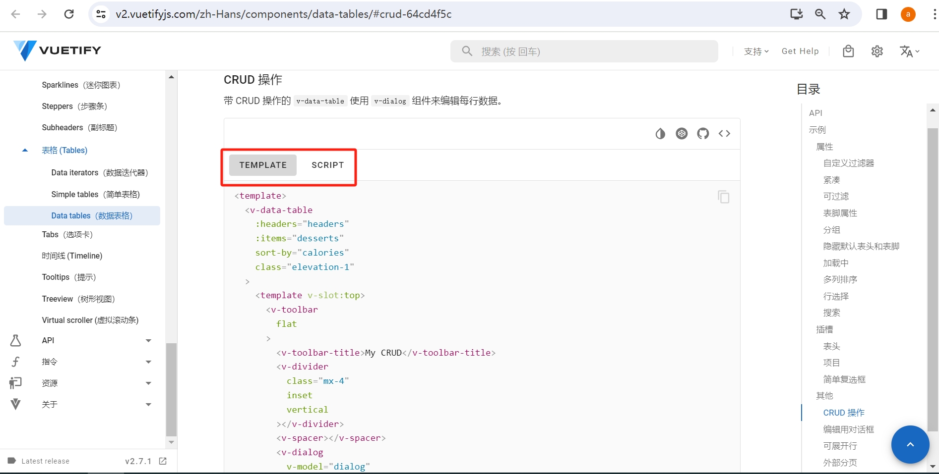
Open the VuetifyJS documentation v-data-table with CRUD Operations, which is a table component with CRUD functionality.
Using the methods learned in the last lesson for utilizing VuetifyJS components, copy the template TEMPLATE and script SCRIPT code to generate the file vuetify-datatable.html.
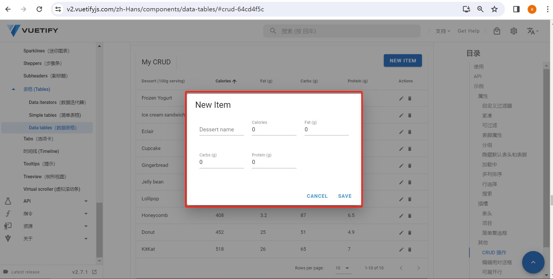
Open this file in a browser, and the following page will appear:
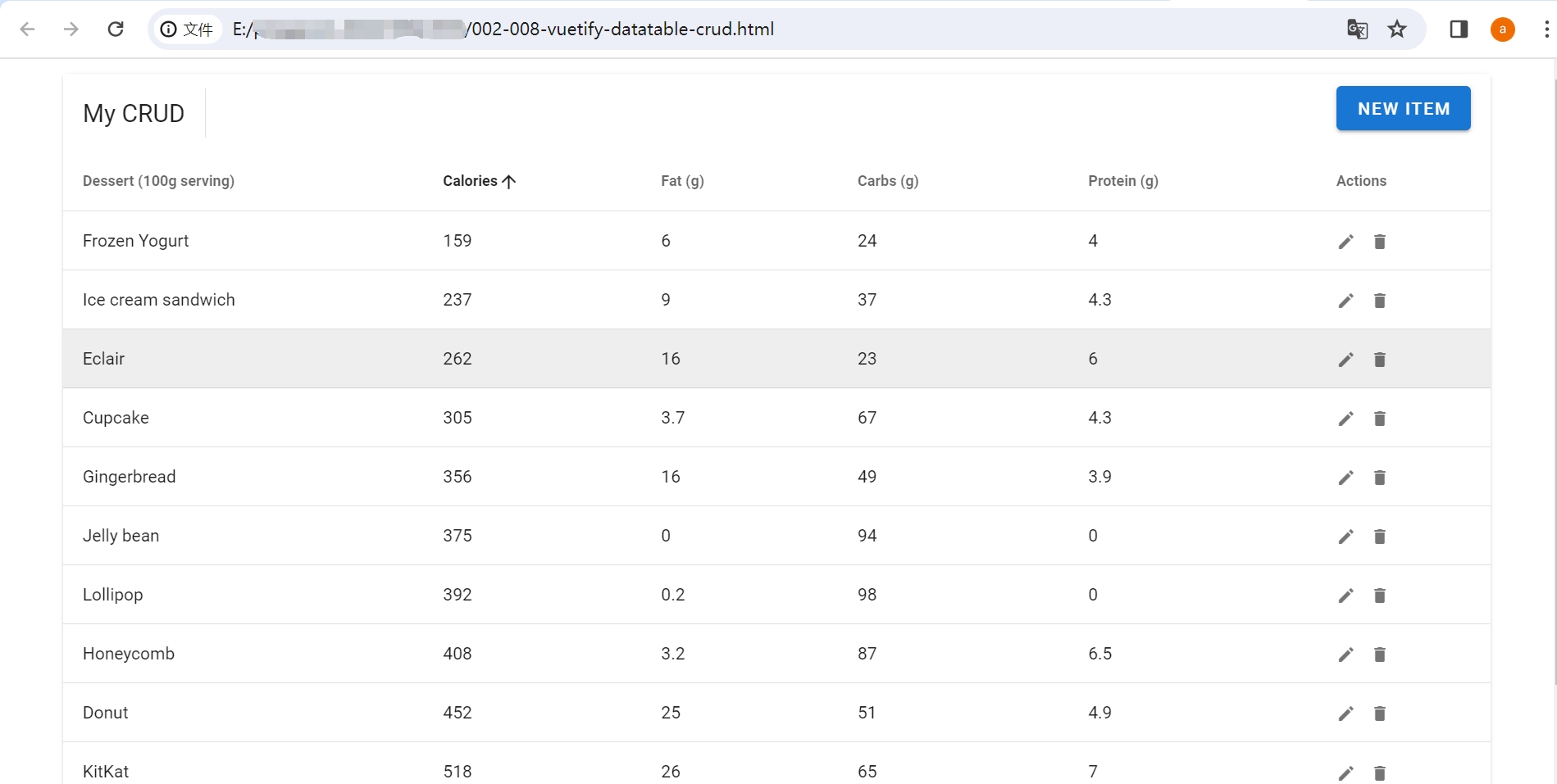
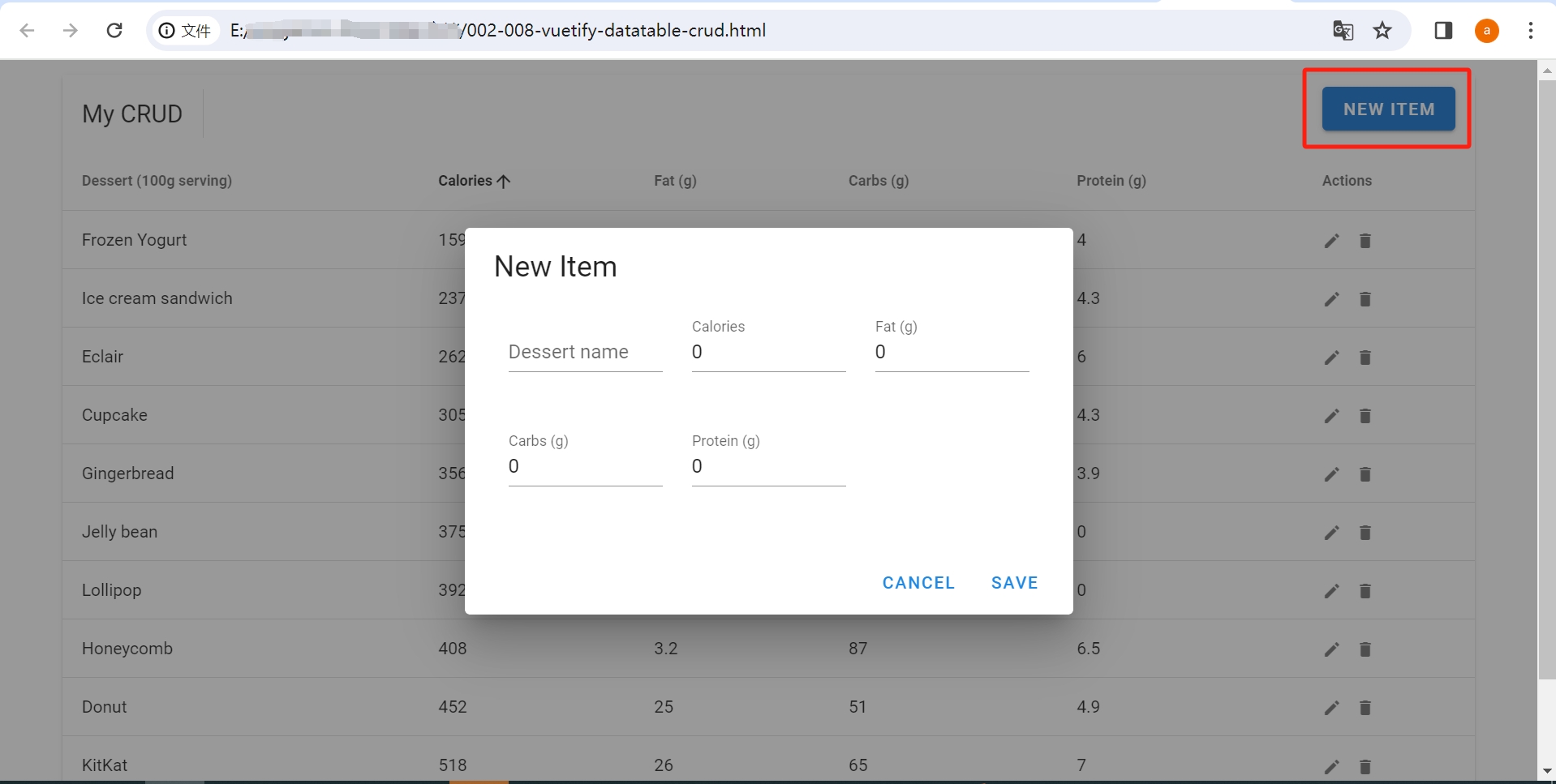
Click NEW ITEM to bring up a dialog box in the shape of a card, enter data, and click SAVE to save the newly added data, which will also appear in the table.
The data table page allows for CRUD operations on data, making it a commonly used page. The data components provided by the Vuetify UI library can accomplish this easily.
3. Familiarizing with the Main Components in the Data Table
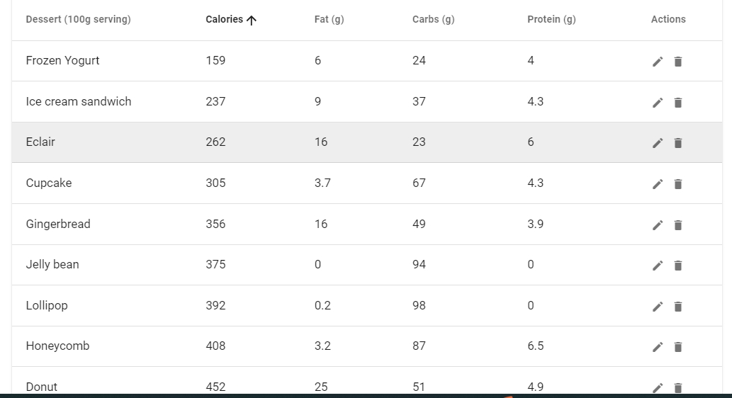
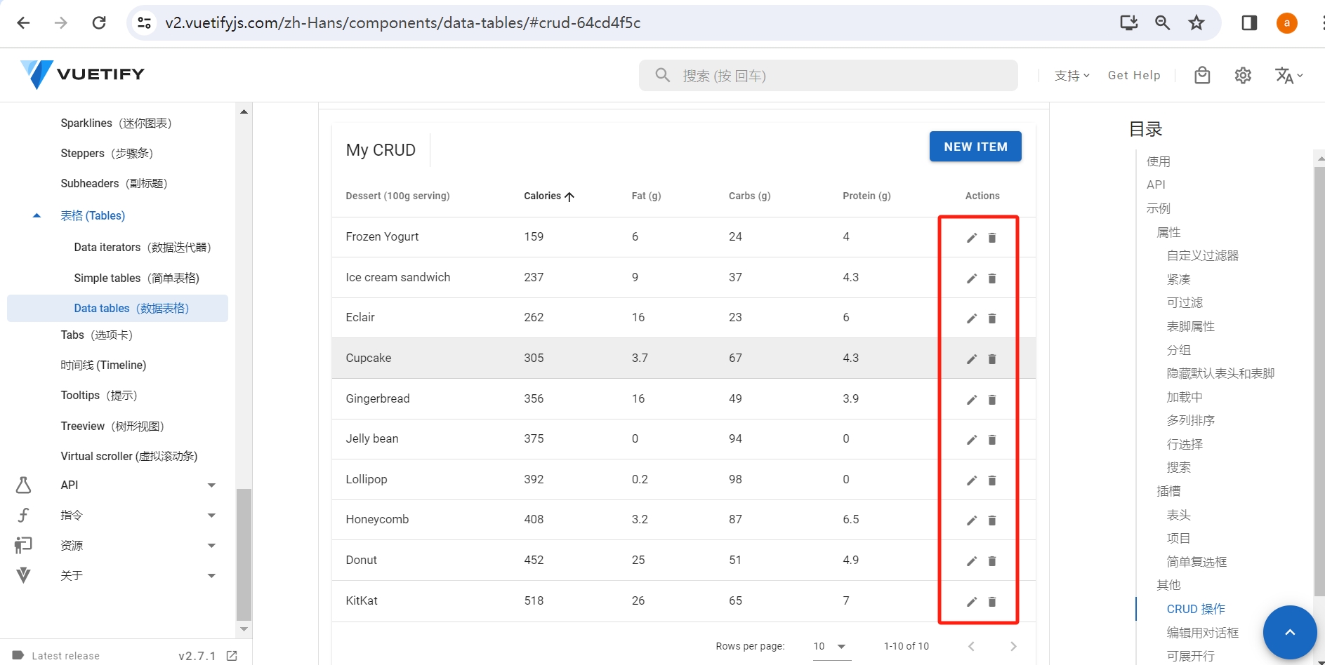
The appearance and functionality of this page's table are richer than the data table you operated on in the last lesson. It includes not just the table but also icons of a pencil and a trash can in the operation bar, which can be clicked to open dialogs for modifying and deleting data; above the table, there is a NEW ITEM button that opens a dialog for adding new data.
Looking at the template part of the code, you will find multiple components used, primarily v-data-table, v-dialog, and v-slot. If you want to enrich the appearance and functionality of the page, you can use multiple components together.
Next, find the corresponding relationships between the appearance of the page and the components in the code to learn how to use these components.
Usage of the v-data-table Component
The v-data-table component is used to display and handle table data.
In the code, find the code wrapped in <v-data-table ...></v-data-table>:
   <template>
     <v-data-table
       :headers="headers"
       :items="desserts"
       sort-by="calories"
       class="elevation-1">

     ......

     </v-data-table>
   </template>
The v-data-table template binds two important variables, headers and items. The data in the template exists within these two variables, where headers represents the table headers and items represents the data in the table. By defining the variables as needed, you can create your own table. Below is the definition of headers and items in the script.
<script>
   ......

   headers: [
        { text: 'Dessert (100g serving)', align: 'start', sortable: false, value: 'name' },
        { text: 'Calories', value: 'calories' },
        { text: 'Fat (g)', value: 'fat' },
        { text: 'Carbs (g)', value: 'carbs' },
        { text: 'Protein (g)', value: 'protein' },
        { text: 'Actions', value: 'actions', sortable: false },
   ],
   ......

   this.desserts = [
          { name: 'Frozen Yogurt', calories: 159,fat: 6.0, carbs: 24, protein: 4.0,},
          { name: 'Ice cream sandwich', calories: 237, fat: 9.0, carbs: 37,  protein: 4.3,},
          { name: 'Eclair', calories: 262, fat: 16.0, carbs: 23, protein: 6.0,},
   ],
</script>
Usage of the v-dialog Component
The v-dialog component is used to create pop-up dialog boxes. When you click NEW ITEM, a dialog box appears for adding new data.
In the code, find the code wrapped in <v-dialog v-model="dialog"...></v-dialog>:
  <template>
    <v-dialog v-model="dialog" max-width="500px">
       ......
    </v-dialog>
  </template>
This is the dialog box, which can contain cards, forms, and other components.
Usage of the v-slot Component
If you feel that the content of the components is not personalized enough, the v-slot component can add personalized content to the existing components. For example, in the actions column of the data table, using icons of a pencil and a trash can to represent editing and deleting is very intuitive; this is the role of the slot v-slot.
In the code, find the code wrapped in <template v-slot:item.actions="{ item }"></template>:
   <template v-slot:item.actions="{ item }">
     <v-icon small class="mr-2" @click="editItem(item)">
       mdi-pencil
     </v-icon>
     <v-icon small  @click="deleteItem(item)" >
       mdi-delete
     </v-icon>
   </template>
This adds two icons, a pencil and a trash can, in the Actions column of the table.
By finding the corresponding relationships between the appearance of the page and the three components, you will have a better understanding of how to write code using Vuetify components.
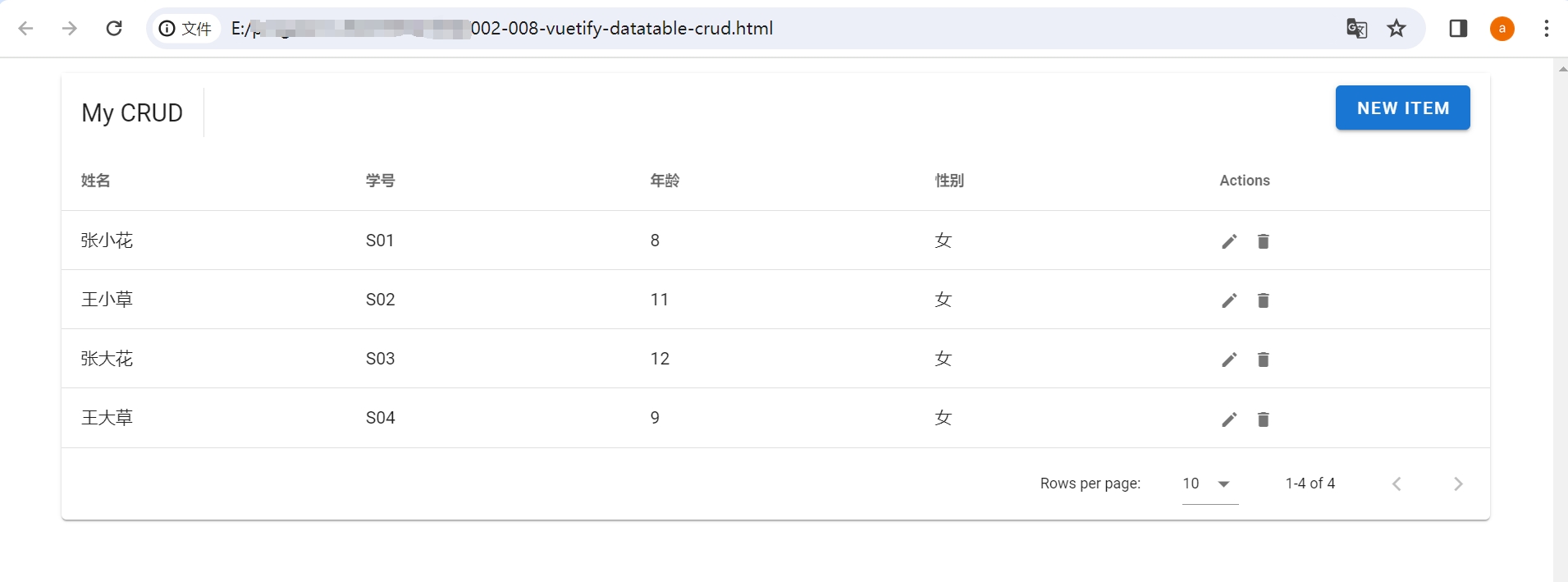
4. Project: Write a Student Management Data Table Based on the Documentation
The above page is the management page for desserts, but you can also use it to manage student information. Since the rendered data changes, the content of the page will also change accordingly. Therefore, you can achieve this by replacing the corresponding variables:
- Replace
headeranditemswith student-related information, - Replace
desserts: []withstudentList: [], - Replace all
editedItem.xxxxwith properties of the student array object, such aseditedItem.age,editedItem.gender, etc.
   <template>
     <v-data-table :headers="headers" :items="studentList" sort-by="calories" class="elevation-1">
        ......
        <v-card>
        <v-text-field v-model="editedItem.age" label="Age" ></v-text-field>
          ......
        </v-card>
        ......
     </v-data-table>
   </template>
headers: [
{text: 'Name', align: 'start', sortable: false, value: 'name',},
{text: 'Student ID', value: 'id', },
{text: 'Age', value: 'age', },
{text: 'Gender', value: 'gender',},
{text: 'Actions', value: 'actions', sortable: false ,}
],
studentList:[], this.studentList = [
{name: 'Zhang Xiaohua', id: 'S01', age: '8', gender: 'Female'},
{name: 'Wang Xiaocao', id: 'S02', age: '11', gender: 'Female'},
{name: 'Zhang Dahua', id: 'S03', age: '12', gender: 'Female'},
{name: 'Wang Dacao', id: 'S04', age: '9', gender: 'Female'}
]Open it in a browser, and you will see that the headers, content, and dialog box content have all been modified to student information.
5. Simplifying Vuetify Data Table Templates and Functions
Why Simplify?
Carefully reading the code on the above page, you will find it difficult to understand due to unclear hierarchy, with multiple v-dialog components written inside the v-data-table component.
The dialog boxes for adding and modifying share a single v-dialog component, distinguished by the changing value of the variable formTitle to indicate whether it is an add or modify operation, which increases code complexity and is not beginner-friendly.
Learning the Video Tutorial for This Lesson
To address this issue, this course has recorded a video that guides you step by step in simplifying the code, helping you reconstruct a clear and functional page code.
Through the video course, you will learn the principles of simplifying code:
- Extract the dialog components from the data table component and wrap them with
<container></container>tags, making it easier to distinguish what this part of the code corresponds to on the page when viewing the code. - For any page actions like adding, modifying, or deleting buttons, call the same function, passing the type of action as a parameter. This way, all action functions will be grouped together, making their functionality and structure clear (if it cannot all be written to call the same function, the functions should be written separately according to their functionality).
- Variable and function names should be meaningful, allowing people to understand their functionality at a glance.
Download Code Resources